
Case study
7 Conversion Opportunities for Urban E-Bikes: a CRO Case Study
A website audit and advisory session identifying practical opportunities to improve Urban E-Bikes’ customer journey and increase conversions.

Urban E-Bikes is a Dutch e-bike retailer offering a range of electric bikes, accessories and related services.
The challenge
Eva Rouwenhorst was interested in gaining new insights into the Urban E-Bikes webshop and identifying opportunities for further growth. The findings could also help inform the new website design that was being developed.
Website audit & advisory session
I reviewed urbanebikes.nl from the perspective of a new visitor, on both desktop and mobile.
This audit is a heuristic analysis, without the use of visitor data: I evaluated the website using five established heuristics — clarity, relevance, orientation, trust and consistency. This allowed me to answer the questions website visitors often have, and identify points of confusion and friction.
Focus points were:
• First impression (above the fold): do first-time visitors immediately understand what the offer is, if it’s relevant to them, and what the next step is?
• Copy & messaging: is the communication across the rest of the site clear and persuasive, do visitors know where they are, and are there any points that could reduce trust?
• Usability: how easily and effectively can visitors achieve their goals?
Key opportunities
I found seven improvement ideas that Urban E-Bikes could apply.
1. Improve the header’s visual hierarchy and alignment

Current situation
On desktop, the header has an unclear visual hierarchy, with secondary elements such as the utility items with the green background and the Scootercity logo competing for attention with the primary navigation. The breadcrumbs (not in this screenshot) are also placed within the header rather than the body, which is unusual and can be distracting.
The electric bike used as the shopping cart icon is unconventional and may not be immediately recognizable as a cart.
On mobile, the logo and icons are not properly aligned, creating a visually unbalanced and less polished header.

Recommendations
I would simplify the header and strengthen its visual hierarchy by removing irrelevant elements, such as the Scootercity logo, and adjusting the utility bar’s color to reduce visual competition with the primary navigation.
I would also replace the electric bike icon with a conventional shopping cart icon, making its function immediately recognizable.
On desktop, the breadcrumbs should be moved into the body, where they can provide page context without competing with the main navigation.
On mobile, aligning the logo and icons would create a cleaner, more balanced and professional header.
2. Strengthen the homepage above the fold

Current situation
The homepage currently doesn’t communicate the unique value proposition, key USPs, and customer ratings above the fold. These elements are essential to immediately communicate the website’s value, build trust, and give visitors a clear reason to explore further. The initial impression is particularly important for confirming relevance and reducing uncertainty.
There are also no clear calls to action guiding visitors towards relevant sections of the website, such as the different product categories. The homepage images also lack a consistent style, as they are sourced from different brands. This makes the above-the-fold section less effective at helping visitors find relevant products.
Recommendations
Clearly communicate the unique value proposition in the above-the-fold section, while using trust signals and clear calls to action to build confidence and guide visitors towards relevant products.
1. Communicate a clear unique value proposition that immediately explains what makes Urban E-Bikes a compelling choice.
2. Highlight key USPs, such as free delivery, free test rides, installment payment options, and an extended warranty, to reinforce the value proposition and reduce uncertainty.

3. Add the customer rating prominently to establish trust from the first impression. Urban E-Bikes appears to have a customer rating of 9.5/10, which could serve as a strong trust signal.
4. Add clear calls to action that guide visitors towards the product offering, either through a general CTA such as Shop e-bikes or through more specific CTAs for individual product categories.
5. Give more prominence to product categories, helping visitors navigate based on what they are looking for rather than starting with individual brands. As an added benefit, this also resolves the inconsistent visual style caused by using brand-specific imagery.
3. Improve navigation structure and category clarity
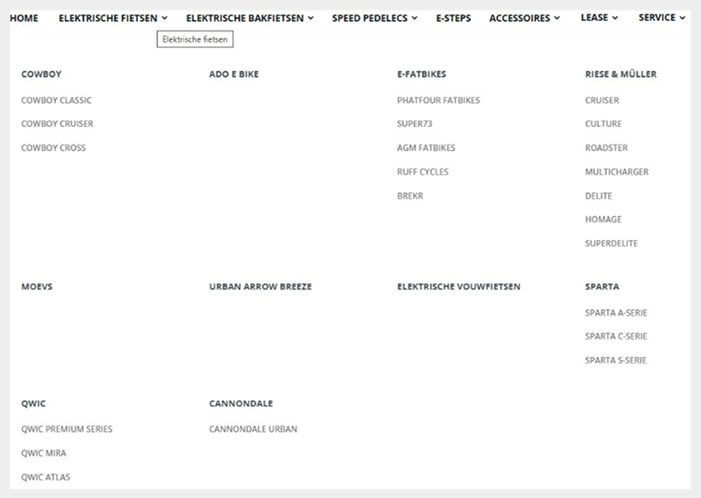
Current situation
Some of the bold categories in the navigation contain products, while others are empty. There is also a significant difference in the number of products shown across categories. The category labels currently appear to be titles rather than clickable elements, making it unclear that they lead to a product lister page.
Empty categories can give the impression that something is missing or broken, creating confusion and making the website feel less polished. In addition, the navigation currently mixes brands with (sub)categories, making the structure less intuitive for visitors.
Recommendations
I would remove empty categories and create a more consistent structure, with a more balanced number of items shown per category.
One option would be to separate product (sub)categories from brands, giving visitors two clear ways to navigate the range: based on the type of product they are looking for or by brand.
The category labels should also be clearly presented as clickable links to the relevant product lister pages, rather than appearing as titles only.
4. Strengthen the product page above the fold
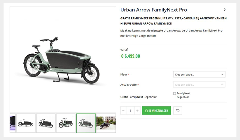
Current situation
The above-the-fold section of the product pages contains few elements that actively support the purchase decision. The product image and price naturally attract most of the attention, while the GWP promotion (rain cover) is the only prominent element aimed at persuading visitors.
This leaves an opportunity to provide more reassurance and communicate the product’s value more effectively at the point where visitors form their first impression of the product.
Recommendations
Strengthen the above-the-fold section with additional trust and value elements, such as:
1. Add product ratings and reviews to provide social proof.
2. Highlight key USPs, covering both product benefits and service-related benefits.
3. Give the GWP promotion more visual prominence, for example by adding a badge or label to the product image.
5. Prioritize products on lister pages
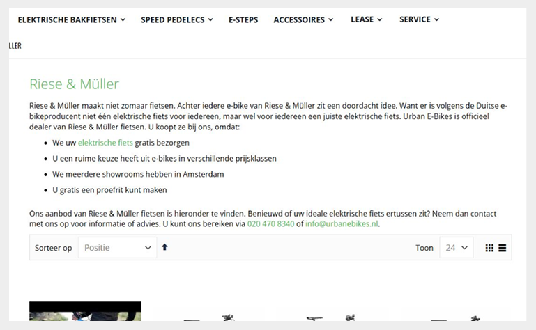
Current situation
A large block of text appears above the products on the lister pages, meaning visitors cannot see the products immediately. On a product lister page, visitors generally expect to see the available products first.
Large blocks of introductory text are also unlikely to be read in full and do little to encourage engagement with the products. This makes the current layout less effective at getting visitors into the product selection.
Recommendations
Remove the large block of text above the products and show the product selection immediately to encourage engagement.
If additional visual context is needed, consider adding a header image with a clear headline at the top of the page. This can provide visual stimulation while making the subject of the lister page immediately clear.
Relevant USPs from the existing text could be moved into a dedicated USP bar. If the longer text is valuable for SEO/GEO, it could instead be placed further down the page, where it does not interfere with product discovery.
6. Make sale messaging consistent

Current situation
Some products display a sale badge without showing an original and discounted price, while other discounted products show a price reduction without a sale badge. This inconsistency can create confusion and makes it less clear which products are currently on sale.
Recommendations
Use a consistent approach to communicate discounts across all products. Products with a discount should display a sale badge, and every product with a sale badge should clearly show both the original and discounted price.
This makes promotions easier to recognize and helps visitors immediately understand the price advantage.
7. Prevent confusing add-to-cart interactions

Current situation
For some products, the Add to cart button on the lister page does not work as expected because visitors still need to make selections on the product detail page (PDP). Visitors who expect the cart in the top-right corner to be updated are instead redirected to the PDP, where they encounter an error message.
This creates a confusing interaction and can undermine trust in the shopping experience.
Recommendations
At a minimum, Add to cart buttons should not be displayed on lister pages when the product cannot be added to the cart without first making additional selections on the PDP.
There is also a strong possibility that customers want to review product information on the PDP before purchasing a relatively high-priced product such as an e-bike. If this is supported by the data, removing the Add to cart buttons from lister pages altogether could provide a more consistent and natural journey.
Priorities / Recommendations
Based on the audit findings, I identified three key areas that I would prioritize for further optimization:
1. Clarify the navigation and product structure
Create a clearer distinction between product categories and brands, remove empty categories, and make navigation elements clearly recognizable as clickable. A more intuitive structure can make it easier for visitors to find relevant products and explore the range.
2. Strengthen the value proposition and trust above the fold
Use the homepage and product pages to communicate key USPs, ratings, reviews and other trust signals earlier in the user journey. For a relatively high-value purchase such as an e-bike, providing reassurance and clearly communicating the value of the product and service can be particularly important.
3. Simplify product discovery and interactions
Prioritize products on listing pages, make promotional messaging consistent, and avoid showing Add to cart options when products require additional choices on the PDP. The goal should be to make the path from browsing to product evaluation as clear and frictionless as possible.
These recommendations should be validated with user behaviour and conversion data where possible. Analytics can help determine which opportunities have the greatest potential impact and whether visitors, for example, typically navigate through categories, visit product pages before adding an e-bike to their cart, or engage with the current lister page CTAs.
Advisory session
I presented the audit findings during an advisory session, where we discussed the recommendations in more detail and explored possible approaches to implementation, including how the insights could be incorporated into the new website design that was already in development. The session also provided an opportunity to answer strategic and practical questions and advise on how the different improvements could be prioritized and approached.
An important part of the session was understanding the reasoning behind the recommendations: why visitors may behave in certain ways, what they may need at different stages of their journey, and what is behind the identified opportunities. This helps the client not only understand what could be improved, but also why these improvements are relevant and how to approach future optimization opportunities.
Looking for help with your website? Learn more about my services or get in touch directly.