
Case study
6 Conversion Opportunities for Bloom Within: a CRO Case Study
A CRO audit and advisory session to identify opportunities to improve Bloom Within’s website and support the growth of a new audience after relocating from Frankfurt to Amsterdam.

Bloom Within is a somatic practice offering sessions that can be booked online, focused on nervous system regulation, stress relief and reconnecting with the body through movement, breathwork, meditation and sound.
The challenge
After relocating from Frankfurt to Amsterdam, Zu Solares needed to build a new audience for Bloom Within. She recognized that the website needed to speak to people who were not yet familiar with her practice, and that the messaging in particular could be improved to communicate the offer in a way that would resonate with the right audience. She was also looking for a fresh perspective from someone with CRO experience to review the website more broadly and identify opportunities to improve the user experience and conversion.
Website audit
I started with the website audit for Bloom Within By Zu, which I did from the perspective of a new visitor, on the devices desktop and mobile.
This audit is a heuristic analysis, without the use of visitor data: I evaluated the website using five established heuristics — clarity, relevance, orientation, trust and consistency. This allowed me to answer the questions website visitors often have, and identify points of confusion and friction.
Focus points were:
• First impression (above the fold): do first-time visitors immediately understand what the offer is, if it’s relevant to them, and what the next step is?
• Copy & messaging: is the communication across the rest of the site clear and persuasive, do visitors know where they are, and are there any points that could reduce trust?
• Usability: how easily and effectively can visitors achieve their goals?
Key opportunities
I identified six opportunities to improve Bloom Within’s website.
1. Improve navigation readability and contrast
Current situation
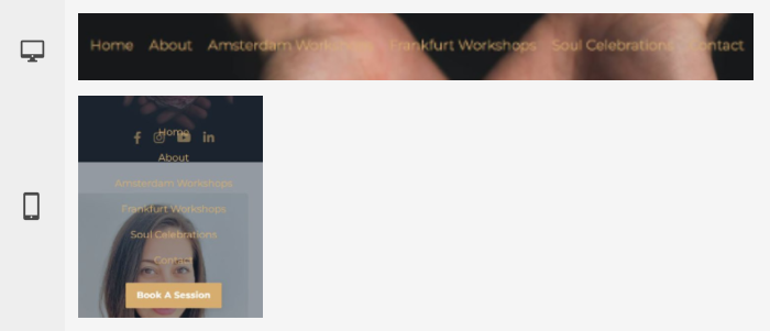
Some navigation items are difficult to read because there is insufficient contrast between the text and the background. This makes the navigation harder to scan and increases the effort required to identify and select menu items.
Recommendations
Replace the transparent navigation background with a solid dark color, such as black or dark grey. This would create more consistent contrast across the navigation and improve readability and ease of use.
2. Strengthen the value proposition above the fold
Current situation
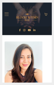
The homepage does not communicate a clear, unique value proposition or highlight any key USPs above the fold. A clear headline could help immediately communicate what Bloom Within offers and what makes the practice different and relevant to visitors.
Recommendations
Strengthen the above-the-fold section with a clear headline that communicates Bloom Within’s unique value proposition and immediately gives visitors an understanding of what the practice offers and who it is for.
Support this with relevant USPs that highlight the key benefits or characteristics of the practice. Together, these elements can make the value proposition clearer, help visitors quickly determine whether Bloom Within is relevant to them, and encourage them to explore the website further.
3. Improve button clarity and recognizability
Current situation
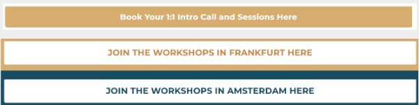
Some buttons are unusually wide and contain relatively long call-to-actions. This can make them harder to recognize as interactive elements, as they may be perceived more like banners or content blocks than clickable buttons.
Recommendations
Reduce the width of the buttons and use shorter, more focused call-to-actions. Buttons generally benefit from a compact design, while short CTAs make their purpose easier to understand at a glance.
As a guideline, keep button labels to a few words where possible, ideally no more than three, to improve clarity and make the purpose of each button immediately clear.
4. Create a more consistent visual system
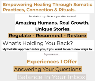
Current situation
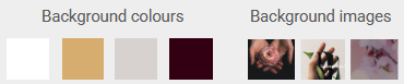
The interface uses inconsistent visual styling, with frequent changes in background colors, large variations in contrast, inconsistent text styling, and abrupt transitions between sections. This reduces visual coherence and makes the hierarchy of the page less clear, which can make the content harder to process and navigate.
Recommendations
Create a more consistent visual system by limiting the number of background colors, standardizing contrast levels, and applying consistent styling to text and other elements.
Backgrounds & contrast
Use one primary base color across most sections and introduce one or two subtle variations of that base, such as slightly tinted or shaded backgrounds, to create separation without harsh transitions. Reserve stronger contrasts, such as a dark section on an otherwise light website, for key moments or highlighted content.
Typography
Limit the typography system to one or two font families and define a clear hierarchy with three to four fixed text styles, such as title, subtitle, body and caption. Reuse these styles consistently throughout the website and avoid arbitrary changes in color, size or weight. Keeping heading styles predictable makes the structure of the content easier to understand.
Use background colors deliberately to structure and differentiate content, while applying typography consistently to strengthen hierarchy and readability. Together, these changes can create a more cohesive and professional visual system.
5. Improve readability and clarity of the review section
Current situation
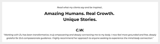
The website contains several readability issues that can negatively affect scannability, comprehension and credibility. The review section on the homepage is a good example.
The title is large and visually dominant, but does not communicate what the section is about or why it is relevant to visitors. The purpose of the section therefore requires additional interpretation. At the same time, the testimonial itself lacks sufficient visual emphasis, making it less prominent than it should be.
Recommendations
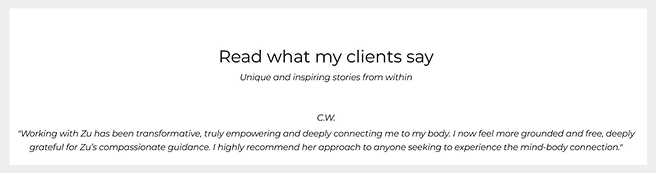
Reduce the visual dominance of the title by lowering the font weight, and adjust the copy of the headline and subheadline, to create a clearer visual hierarchy and communicate the message more effectively. Do make sure the font weights of all section headlines are consistent.
Make the subject of the section explicit in the headline, while using the supporting copy to provide additional context and detail. The copy should clearly communicate the purpose, relevance and value of the section, while giving the testimonial itself more visual emphasis.
6. Create a clearer path from category to detail page
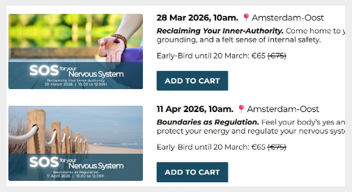
Current situation
On the Amsterdam events category page, there is no clear option to view an event’s detail page and find more information. Visitors who want to learn more may not realize that they can access the detail page by clicking the image.
This creates friction in the journey from browsing to exploring an event in more detail, as an important next step is not clearly communicated.
Recommendations
Make the option to view more information more explicit and create a clearer path from the category page to the detail page.
For example, replace the Add to cart CTA with a View details CTA, or add a View details option alongside the existing Add to cart button. This gives visitors a clear next step when they want to learn more before deciding whether to book.
Priorities / Recommendations
Based on the audit findings, I identified three key areas that I would prioritize for further optimization:
1. Clarify the value proposition and messaging
Strengthen the messaging across the website to clearly communicate what Bloom Within offers, who it is for, and what makes the practice different. This is particularly important when building a new audience and can help visitors quickly understand whether the offering is relevant to them.
2. Create a more consistent and readable user experience
Establish a clearer visual system across the website, with more consistent typography, backgrounds, contrast and component styling. Combined with clearer content hierarchy and messaging, this can make the website easier to scan, understand and navigate.
3. Make the path to conversion more explicit
Give visitors clearer next steps throughout the website, particularly when moving from category pages to detail pages. Clearer CTAs and more recognizable interactive elements can help visitors find the information they need and move towards booking a session.
Advisory session
I presented the audit findings during an advisory session, where we discussed the recommendations and explored the broader challenges around Bloom Within’s website and positioning.
A key topic was how to communicate Bloom Within’s offer to different audiences. The practice can be described and positioned in several different ways, with different messages naturally appealing to different groups while potentially putting others off. We discussed the importance of focusing on the desired outcomes for the visitor and communicating the offer in a way that connects with what different audiences are looking for. I also recommended creating separate landing pages for different audience groups, allowing the messaging and value proposition to be tailored to their specific needs and motivations.
In addition to messaging and positioning, we discussed a range of strategic and practical topics, including the visual style and consistency of the website, the user journey and funnel, calls to action, and ways to gather more customer feedback and insights. We discussed using these insights to inform future website optimizations, as well as actively collecting customer reviews and ratings and incorporating them into the website to strengthen trust and credibility.
The session provided an opportunity to answer both strategic and practical questions, explain the reasoning behind the audit findings, and discuss different approaches to improving the website. This helped translate the audit findings into actionable ideas while giving Bloom Within a clearer understanding of how visitor needs, messaging, design, customer insights and the overall user journey work together to support conversion.
Looking for help with your website? Learn more about my services or get in touch directly.